
中文版
October 2025: A Data-Driven Warning About Where We Stand in the Economic Cycle
Have you ever noticed how the same story keeps playing out, generation after generation, just with new characters and shinier packaging? Every generation believes they're living through something unprecedented, something extraordinary, something different. But what if it's not different at all? What if we're just watching the same movie again, and this time, almost nobody is paying attention?
The Metric That Predicted Every Major Crash
There's a pattern hidden in plain sight that has predicted every major market crash in American history. It's not complex. It's not proprietary. It's simply the relationship between how much the stock market is worth and how much money exists in the economy - what we call the Market Capitalization to M2 Money Supply ratio.
Think of it this way: if all the money that could potentially flow into stocks is already there, where does the next dollar come from to push prices higher?
Let me show you what history teaches us, using real data from the Federal Reserve Economic Database (FRED).
The Four Horsemen of Market Apocalypse
1929: The Original Sin
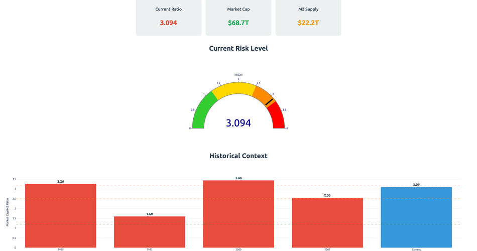
- Market Cap/M2 Ratio: ~3.26
- The Story: "New era" thinking dominated. Radio, automobiles, and electricity were revolutionizing society. Everyone could get rich with margin loans.
- The Reality: When the ratio hit 3.26, there was literally no more fuel for the fire. The subsequent crash wiped out 89% of market value.
2000: The Digital Delusion
- Market Cap/M2 Ratio: ~3.44
- M2 Money Supply: $4,711.7 billion (March 2000)
- The Story: The internet changed everything. Profits didn't matter. "Clicks" and "eyeballs" were the new currency.
- The Reality: The NASDAQ fell 78%. It took 15 years to recover.
2007: The Housing House of Cards
- Market Cap/M2 Ratio: ~2.55
- M2 Money Supply: $7,428.4 billion (October 2007)
- The Story: Real estate never goes down. Financial innovation eliminated risk.
- The Reality: Global financial system nearly collapsed. Millions lost their homes.
Where Are We Now? The Uncomfortable Truth
As of October 2025, here's where we stand:
- S&P 500: 6,792 (October 24, 2025)
- M2 Money Supply: $22,195.4 billion (August 2025)
- GDP: $30,485.7 billion (Q2 2025)
- Corporate Debt: $13,965.5 billion (Q2 2025)
- Estimated Market Cap/M2 Ratio: ~3
The Warning Signs Are Flashing
1. Money Supply Growth Has Stalled
From 2020 to 2022, M2 exploded from $15.4 trillion to $21.7 trillion - a 41% increase in just two years. But look at what's happened since:
- 2024 average: $21.2 trillion
- 2025 current: $22.2 trillion
- Growth rate: Nearly flat after adjusting for inflation
When the fuel tank stops refilling, the engine eventually sputters.
2. Corporate Debt: The Hidden Time Bomb
Corporate debt has ballooned to $13.97 trillion, up from $11.74 trillion in early 2020. Companies borrowed heavily when rates were near zero. Now they're rolling over that debt at 5%+ rates. The math:
- Total corporate debt: $13.97 trillion
- Average interest rate increase: ~3%
- Additional annual interest burden: ~$420 billion
That's $420 billion that won't go to growth, innovation, or shareholder returns.
3. The Valuation Extremes
The stock market capitalization to GDP ratio (the "Buffett Indicator") hit 194.9% in 2020, the highest ever recorded. While it's moderated somewhat, we're still at historically extreme levels compared to:
- 1975: 41.8%
- 1990: 51.9%
- 2000: 147.4%
- 2008: 78.5%
- 2020: 194.9%
4. The AI Bubble: This Generation's "New Paradigm"
Today, it's artificial intelligence. Companies add "AI" to their press releases and watch their stocks soar. Sound familiar?
- In 1999, companies added ".com" to their names
- In 2007, everything was a "financial innovation"
- In 2025, everything has "AI capabilities"
The technology is real. The potential is enormous. But so was the internet in 2000, and we know how that ended.
The Pattern Nobody Wants to See
Here's what the data tells us about where we are in the cycle:
Late-Stage Indicators ✓ All Present
- Record Corporate Debt Levels ✓
- Current: $13.97 trillion
- Growing slower as rates bite
- M2 Growth Stagnation ✓
- 2020-2022: 41% growth
- 2024-2025: <5% growth
- Extreme Valuations ✓
- Market Cap/M2 approaching danger zone
- Buffett Indicator at historic highs
- Speculation in New Technology ✓
- AI mania mirrors dot-com bubble
- Profitless companies with billion-dollar valuations
- Retail Participation at Peaks ✓
- Everyone's a trader again
- Social media full of "investment advice"
- Credit Markets Showing Stress ✓
- Commercial real estate cracking
- Regional banks under pressure
- Credit card debt at all-time highs
The Mathematical Reality
The Market Cap/M2 ratio is approaching 3.0, a level that has preceded major crashes throughout history. Here's why this matters:
When this ratio gets too high, it means:
- Most available capital is already invested
- Future returns must come from either:
- New money creation (inflation)
- Economic growth (limited by debt burden)
- Multiple expansion (already stretched)
With the Federal Reserve committed to 2% inflation targeting and GDP growth constrained by demographics and debt, where does the next leg up come from?
What's Different This Time? Scale.
If there's one thing that truly is different, it's the scale of everything:
- Global Debt: Over $300 trillion (was $87 trillion in 2000)
- Derivatives Market: Over $700 trillion notional
- Central Bank Balance Sheets: $31 trillion (was $6 trillion in 2007)
- Passive Investing: Now dominates markets, creating momentum both ways
When this unwinds, the cascade will be faster and more violent than ever before.
The Timeline: Reading the Tea Leaves
Based on historical patterns and current data:
Next 6-12 Months: The Last Dance
- Markets may push higher on AI euphoria
- Market Cap/M2 ratio could hit 3.0-3.2
- Corporate earnings start missing expectations
- Credit events begin in weak sectors
12-24 Months: The Unraveling
- Fed forced to choose: save markets or fight inflation
- Corporate debt refinancing crisis
- Unemployment rises as companies cut costs
- Market Cap/M2 ratio peaks and reverses
24-36 Months: The Reckoning
- Full-scale deleveraging
- Potential 40-60% market correction
- Government intervention required
- New cycle begins from lower base
The Playbook for What's Coming
This isn't about timing the exact top - that's impossible. It's about recognizing where we are in the cycle and positioning accordingly:
1. Reduce Risk Gradually
- Take profits on speculative positions
- Increase cash allocation
- Focus on quality over growth
2. Prepare for Volatility
- Reduce leverage
- Diversify globally
- Consider hedges
3. Watch the Key Metrics
- Market Cap/M2 ratio approaching 3.0
- Corporate debt refinancing stress
- Credit spreads widening
- M2 growth rate changes
4. Remember the Fundamentals
- Cash flow matters
- Debt matters
- Valuations matter
- Eventually
The Conversation Nobody's Having
Right now, in October 2025, everyone's still dancing. AI is the future. Markets only go up. The Fed has our back. But the math doesn't lie:
- Current Market Cap/M2: ~3 and rising
- Historical Danger Zone: 3.0-3.4
- Distance to Danger: 10-20% higher from here
We're not at the peak yet, but we're close enough to see it. Close enough that the smart money is quietly heading for the exits while retail piles in.
The Bottom Line
History doesn't repeat exactly, but it rhymes with stunning consistency. The Market Cap/M2 ratio has been a reliable indicator of market extremes for a century. Today, that indicator is flashing yellow, heading toward red.
The pattern is clear:
- Monetary expansion drives asset prices
- Eventually, all available money is invested
- The ratio peaks around 3.0-3.5
- The inevitable unwind begins
We're in stage 2, approaching stage 3.
This time isn't different. It's just bigger, faster, and more interconnected. When the music stops - and it always does - those who recognized the pattern will be prepared. Those who believed "this time is different" will learn the same painful lesson every generation learns.
The question isn't if, but when. And based on the data, "when" is getting uncomfortably close.
Data sources: Federal Reserve Economic Data (FRED), Board of Governors of the Federal Reserve System, U.S. Bureau of Economic Analysis. Analysis based on Market Capitalization/M2 methodology developed from historical financial research.
Remember: This analysis is for educational purposes only. Always conduct your own research and consult with qualified financial advisors before making investment decisions.
Key Metrics to Monitor
Track these monthly:
- M2 Money Supply (FRED: M2SL)
- S&P 500 Level (FRED: SP500)
- Corporate Debt (FRED: TCMILBSNNCB)
- GDP Growth (FRED: GDP)
- Market Cap/GDP Ratio (Calculate from above)
- Market Cap/M2 Ratio (Calculate from above)
When the Market Cap/M2 ratio exceeds 3.0, history suggests extreme caution is warranted.
The pattern is there. The data is clear. The only question is whether we'll learn from history or repeat it.
Again.