
中文版 CHINESE VERSION
In the vast ocean of financial market data, there exists a seemingly simple yet remarkably predictive indicator that has successfully warned of nearly every major economic crisis over the past 100 years — the inverted yield curve.
What is Yield Curve Inversion?
Basic Concept
Imagine lending money to a friend. Normally, you'd charge higher interest for longer loans because of increased uncertainty over time. The bond market works similarly:
- Normal condition:
10-year Treasury yield>2-year Treasury yield - Inverted condition:
10-year Treasury yield<2-year Treasury yield
When long-term rates fall below short-term rates, we have a "yield curve inversion" — typically viewed as a significant market anomaly.
Why Does Inversion Occur?
Yield curve inversions aren't random events. They usually reflect investors' pessimistic expectations about the future economy:
- Declining inflation expectations: Markets expect future inflation to decrease, reducing the compensation required for long-term bonds.
- Economic growth slowdown: Investors anticipate future economic weakness, driving funds toward long-term, stable safe-haven assets.
- Flight to safety: During uncertain times, massive capital flows into long-term Treasuries, pushing up prices and lowering yields.
This phenomenon essentially represents the market's vote on economic prospects, signaling potential downside risks.
Historical Inversions: Near-Perfect Accuracy Record
Let's examine how this indicator performed before several major economic crises, revealing its remarkable predictive power:
The Great Depression (1929)
| Metric | Value |
|---|---|
| Inversion Period | 1928 |
| Inversion Depth | Approximately -0.5% |
| Subsequent Outcome | 1929 stock market crash, followed by the most severe economic crisis in human history — The Great Depression |
The Stagflation Crisis (1973-74)
| Metric | Value |
|---|---|
| Inversion Period | Early 1973 |
| Inversion Depth | Approximately -0.8% |
| Subsequent Outcome | Oil crisis led to global economy trapped in rare "stagflation" — high inflation coexisting with economic stagnation |
The Dot-Com Bubble (2000)
| Metric | Value |
|---|---|
| Inversion Period | Early 2000 |
| Inversion Depth | Approximately -0.6% |
| Subsequent Outcome | Tech stock valuation bubble burst, NASDAQ crashed, US economy entered recession |
The Financial Crisis (2008)
| Metric | Value |
|---|---|
| Inversion Period | 2006-2007 |
| Inversion Depth | Approximately -0.5% |
| Subsequent Outcome | Subprime mortgage crisis triggered global financial tsunami, severely impacting the financial system worldwide |
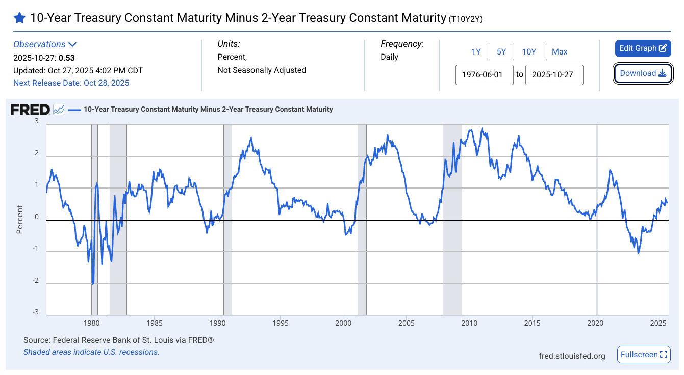
What Makes This Recent Inversion Different?
The most recent yield curve inversion, while also attracting widespread attention, has unique characteristics worth deeper analysis.
Timeline Review
| Time Period | Yield Spread | Status Description |
|---|---|---|
| July 2022 | First negative | 🚨 Inversion begins |
| July 2023 | -1.08% | 🚨 Deepest historical inversion |
| August 2024 | Returns positive | ✅ Inversion ends |
| October 2025 | +0.53% | ✅ Current normal state |
Record-Breaking Characteristics
This yield curve inversion displayed three unprecedented features:
- Longest duration: The inverted state persisted for exactly 26 months (July 2022 to August 2024), breaking historical records.
- Deepest inversion: In July 2023, the
10-yearvs2-yearTreasury spread reached a stunning -1.08%, the deepest inversion in history. - Post-recovery stability: Since returning to normal in August 2024, the yield curve has maintained stable operation for 15 months, sustaining positive steepness.
Market Cap-to-Money Supply Ratio: Another Key Indicator
Beyond the yield curve, there's another metric Warren Buffett calls the "best valuation indicator" worth our attention: the ratio of total stock market capitalization to M2 money supply.
Historical Crisis Ratios
| Crisis Year | Market Cap/M2 Ratio | Crisis Nature |
|---|---|---|
| 1929 | 3.26 | Great Depression |
| 2000 | 3.44 | Dot-com bubble |
| 2007 | 2.55 | Financial crisis |
| 2025 current | ≈3.0 | Relatively High |
Current Assessment
Based on the latest data, we can estimate the current ratio:
- M2 Money Supply: As of December 2024, approximately $21.4 trillion
- Estimated Stock Market Cap: Approximately $67 trillion
- Current Ratio: 3.0
How Dangerous Is the Current Market Really?
🟡 Comprehensive Risk Rating: Moderate Vigilance
Considering all indicators comprehensively, current financial markets are in a state of moderate vigilance, with both positive signals and risks that cannot be ignored.
✅ Positive Signals:
- Yield curve: Has returned to normal, currently maintaining +0.53% positive steepness, showing market pessimism about the future economy has somewhat eased.
- Market Cap/M2 ratio: Has not reached historically extreme bubble levels.
- Inflation pressure: Global inflation pressure has significantly eased, providing room for central bank policy adjustments.
- Fed policy: The Federal Reserve's policy stance is gradually becoming more friendly and dovish, helping stabilize market confidence.
⚠️ Risk Factors:
- Lagged effects: The historically longest inversion period may have delayed effects that haven't fully manifested.
- Valuation levels: While the Market Cap/M2 ratio hasn't reached historical peaks, some sectors or assets remain at historically high valuations.
- Global debt burden: Government and corporate debt levels globally are generally higher than historical levels, increasing economic fragility.
- Geopolitical risks: International geopolitical situations are increasingly complex, with growing uncertainty factors that could trigger market volatility at any time.
How Should We Interpret These Signals?
Insights for Individual Investors
As individual investors, understanding these signals and incorporating them into investment strategies is crucial:
Short-term (Next 6-12 months)
- The yield curve recovery is a positive signal, indicating short-term recession risks have somewhat decreased.
- Maintain cautious optimism while avoiding excessive leverage and maintaining liquidity.
Medium-term (Next 1-2 years)
- Closely monitor the Market Cap/M2 ratio; if it continues rising above 3.0, consider gradual position reduction.
- Watch for changes in Federal Reserve and major global central bank policies, especially any signs of restarting rate hike cycles.
Long-term Allocation
- Maintain diversified investment strategies, spreading risks without putting all eggs in one basket.
- Keep appropriate cash buffers to handle market emergencies or capture potential investment opportunities.
Key Monitoring Indicators
📊 Yield curve spread: Sustained periods below -0.5% require high vigilance, indicating significantly elevated recession risks.
📊 Market Cap/M2 ratio: Approaching 3.0 is an important reduction signal; historical experience shows this is bubble territory.
📊 Federal Reserve policy: Restarting rate hike cycles or sharp monetary policy tightening would be extremely concerning danger signals.
Conclusion
While we cannot find an unchanging "magic number," through deep mining of historical data, we've discovered that the ratio between total stock market capitalization and money supply indeed provides valuable perspective for understanding market cycles and identifying systemic risks. It reveals the dynamic relationship between financial markets and real economy liquidity, serving as a powerful macro indicator for measuring market overheating.
The yield curve, meanwhile, remains one of the most reliable leading indicators in financial markets. While the recent historic inversion has ended, its potential lagged effects and the current elevated Market Cap/M2 ratio suggest we should remain vigilant about market risks while not panicking unnecessarily.
Smart investors should view these indicators as part of a comprehensive risk monitoring dashboard, combining multiple metrics to form a complete picture of market conditions, rather than relying on any single indicator for market timing decisions.
Data source: Federal Reserve Economic Data (FRED), data as of October 2025. Investment involves risks; this article is for reference only and does not constitute investment advice.